
In a country of continental scale, security demands both reach and local presence. A pioneer in electronic security systems in Brazil, Sekron Digital operates in more than 750 municipalities and monitors over 80,000 devices, serving some of the country's largest retail networks, including Grupo Pão de Açúcar, Raia Drogasil, Banco Safra, Casas Bahia, Nike, and Leroy Merlin.
As the operation grew, it became clear that the brand's identity needed to keep pace.
The previous identity still read as an alarm company. It captured neither the national scale of the operation nor the data-driven layer that now underpins its services. Today, Sekron does more than monitor incidents: it interprets data, anticipates risk, and supports strategic decisions.
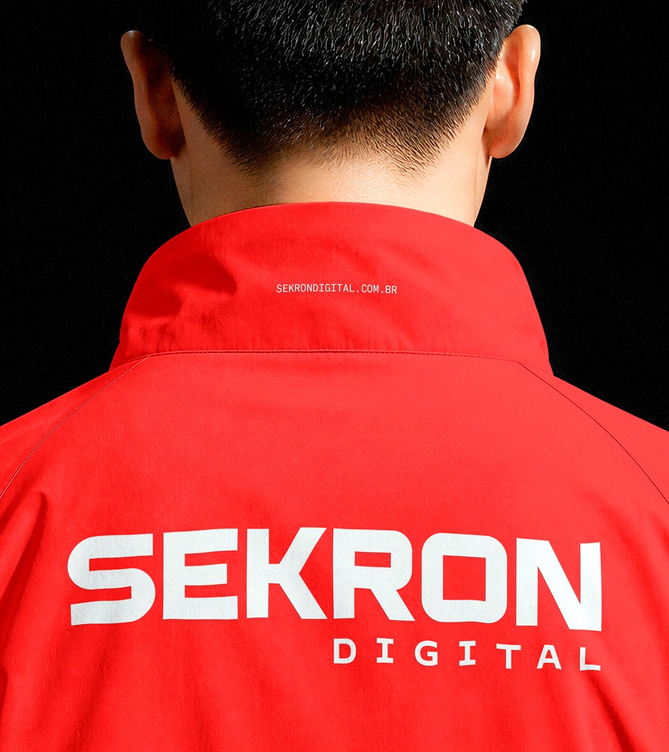
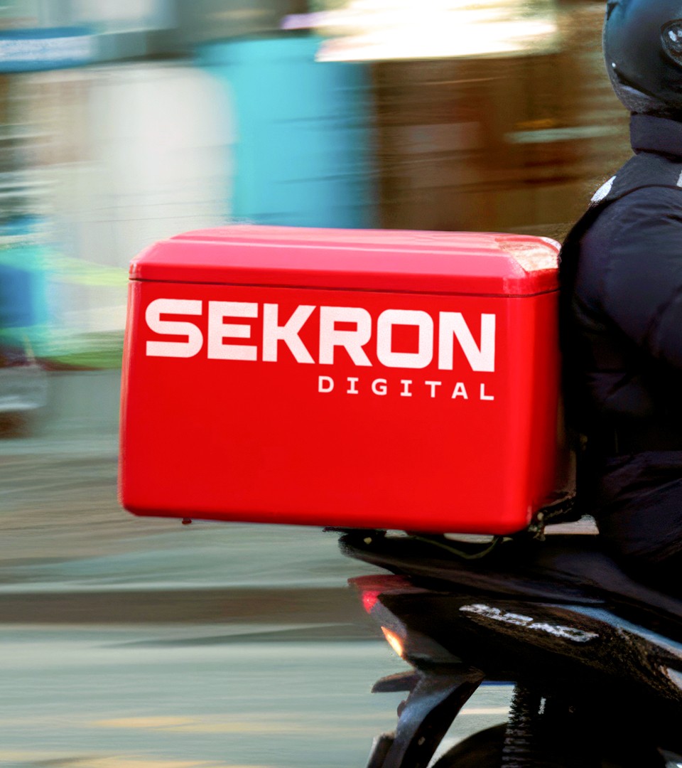
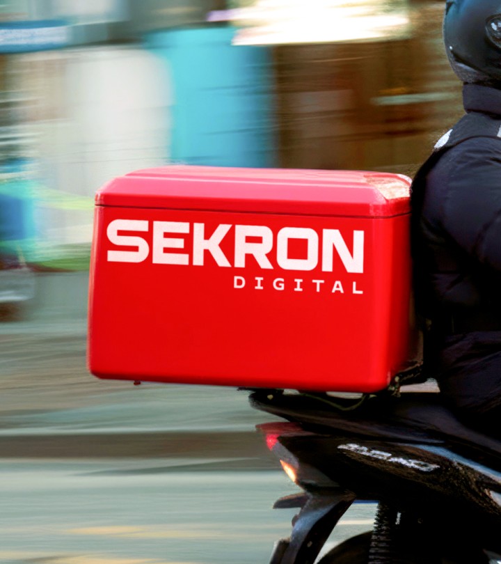
The challenge was to reposition the brand to reflect this shift: from surveillance to intelligence. The first step was revisiting the brand itself. We moved away from the previous symbol, whose construction blurred into other signs common across the sector, and developed a squared, robust logotype that reinforces a sense of precision, stability, and trust.
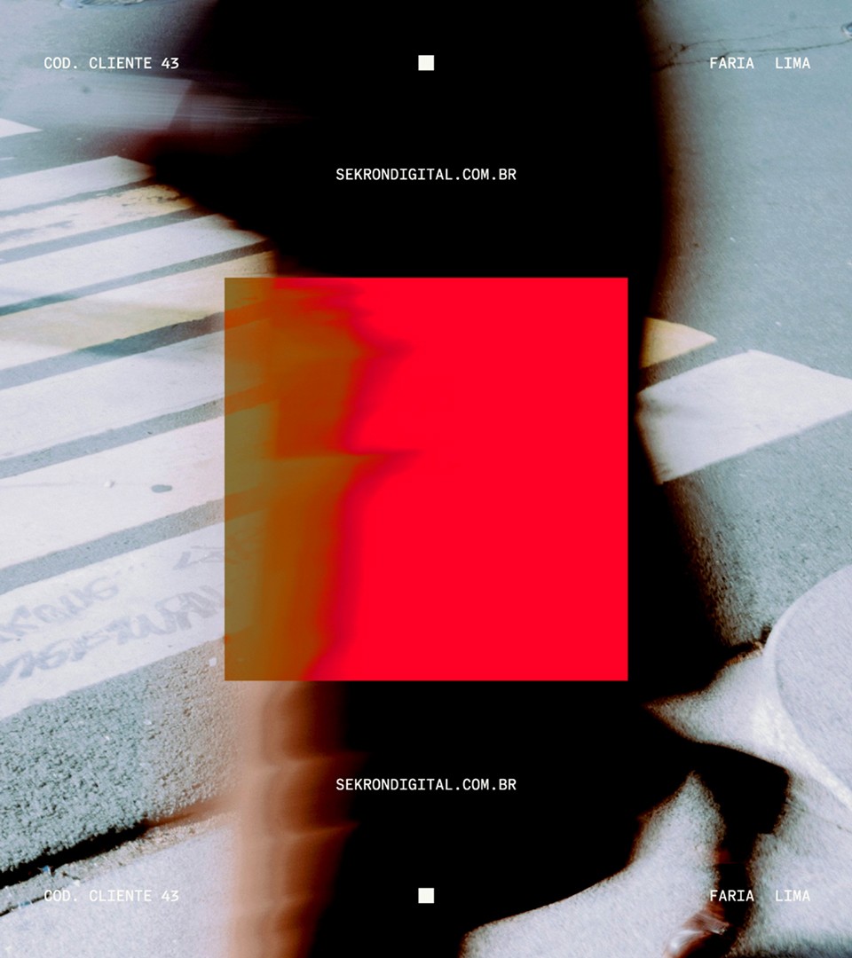
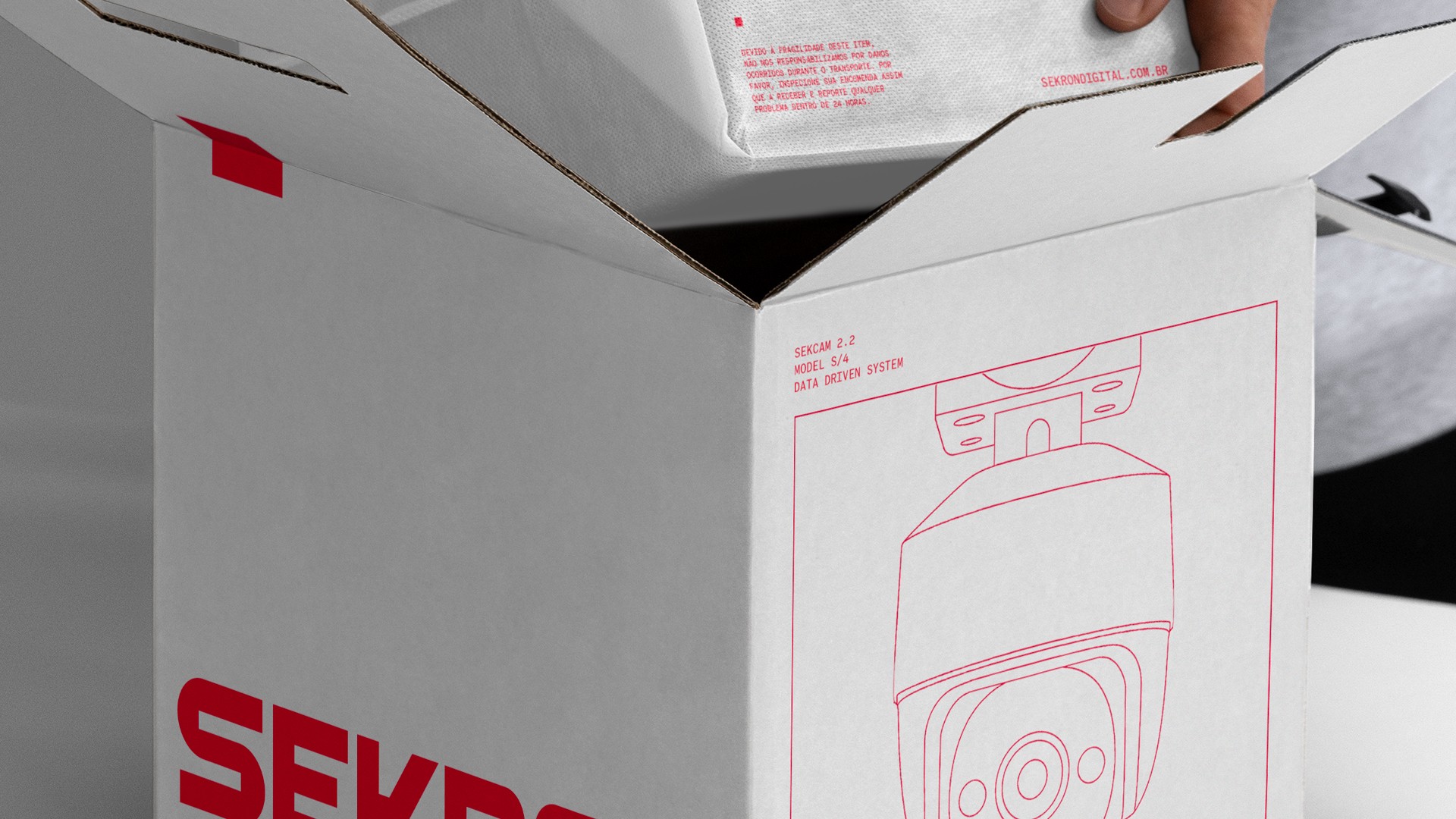
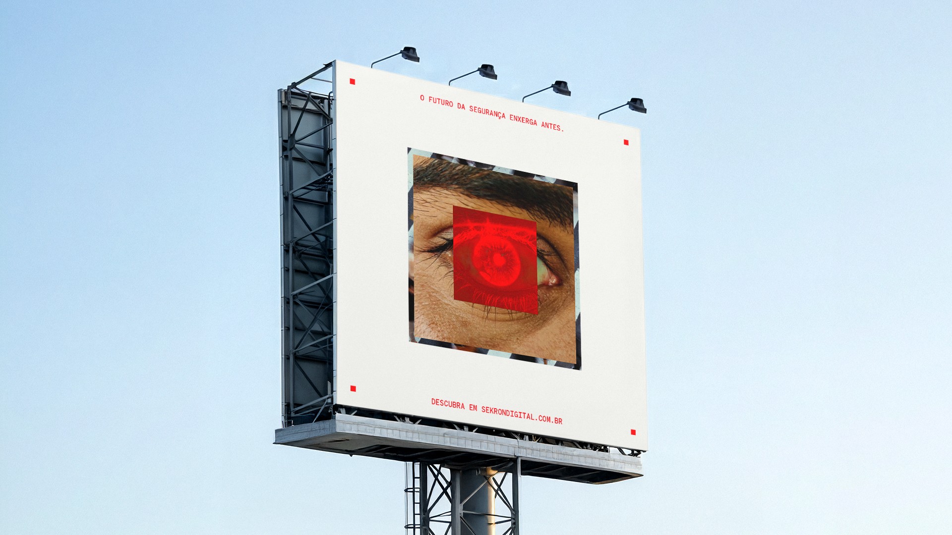
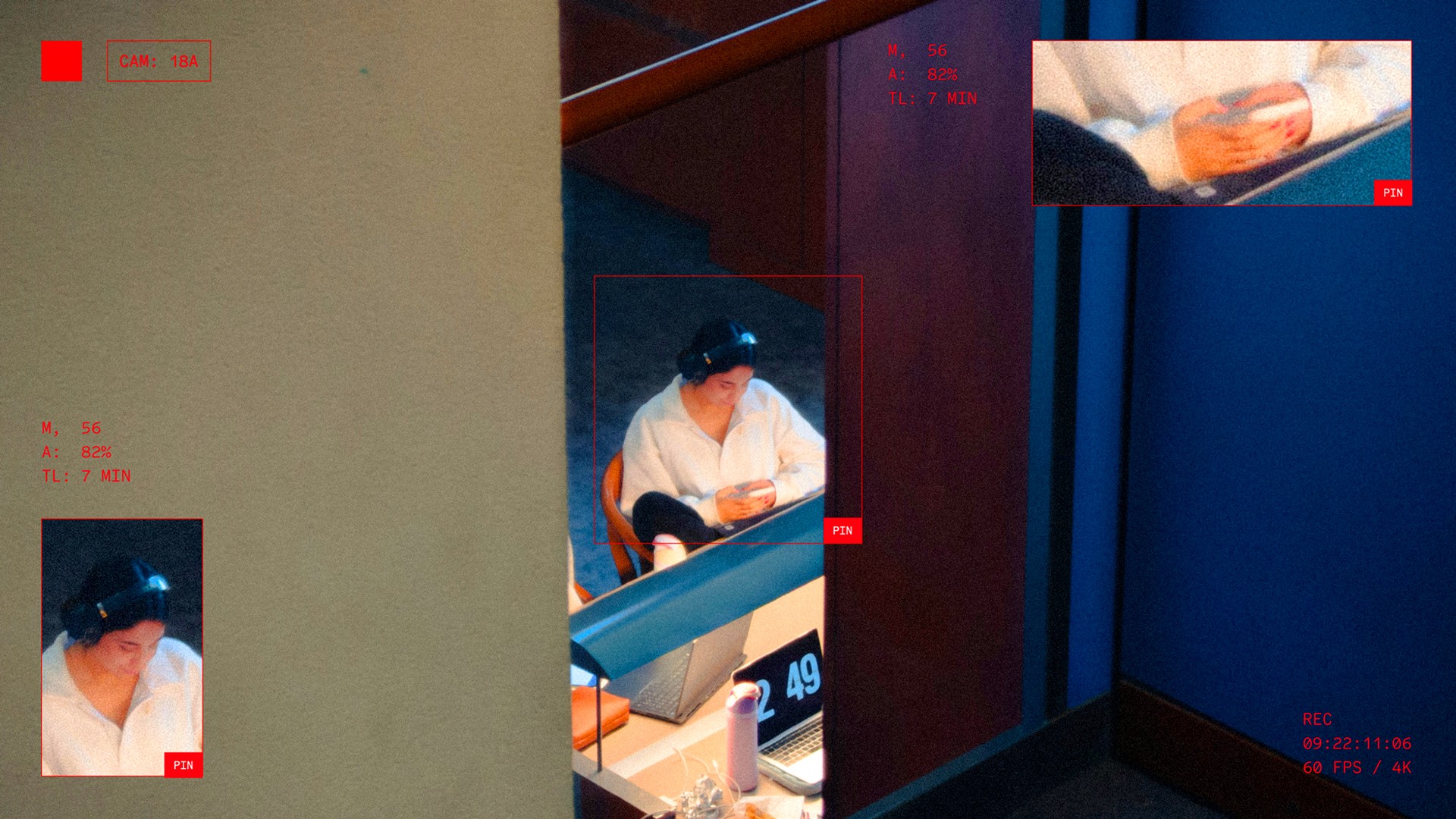
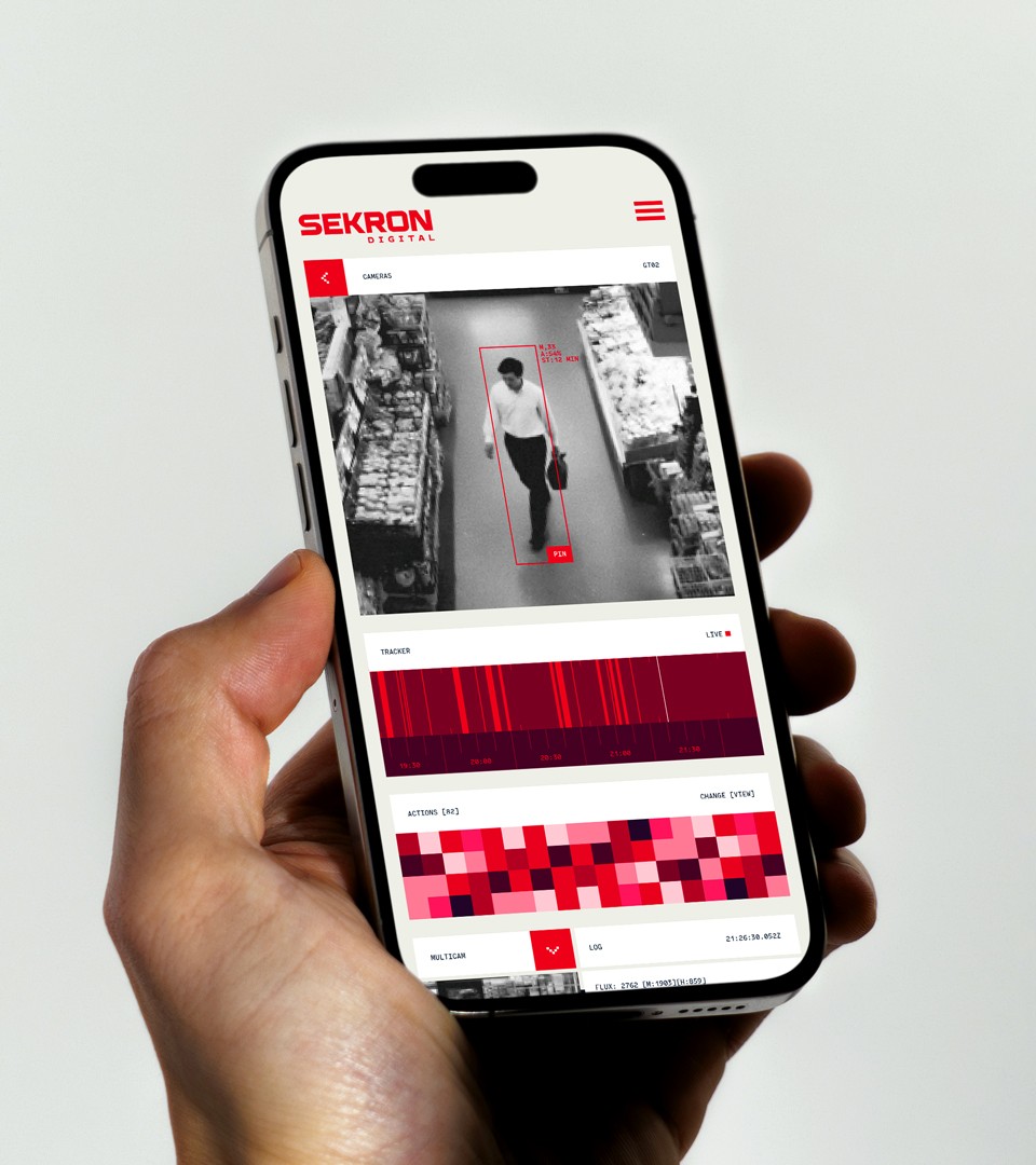
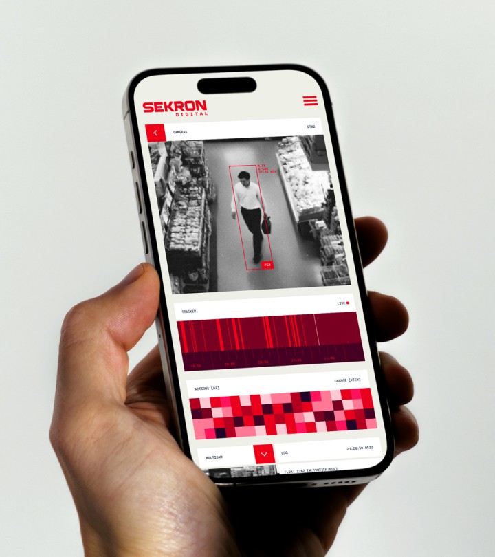
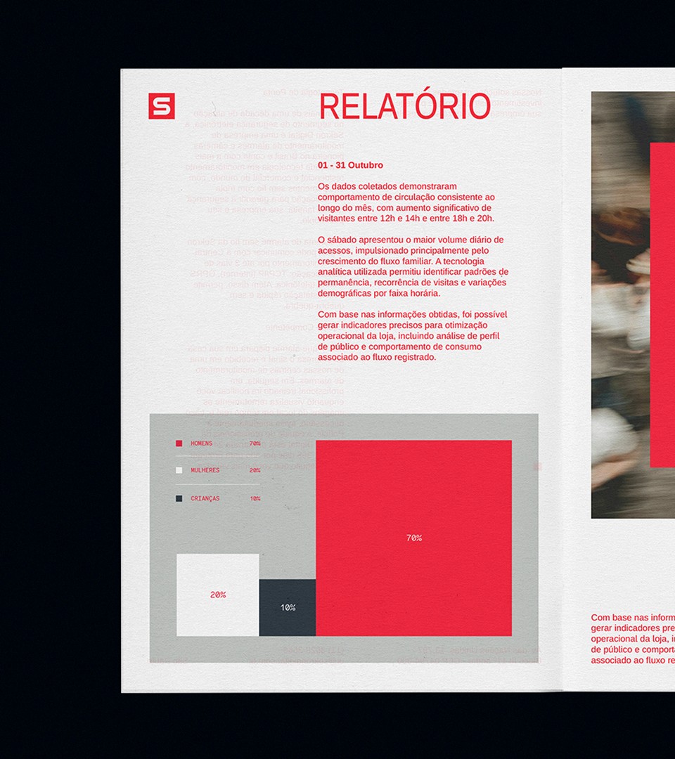
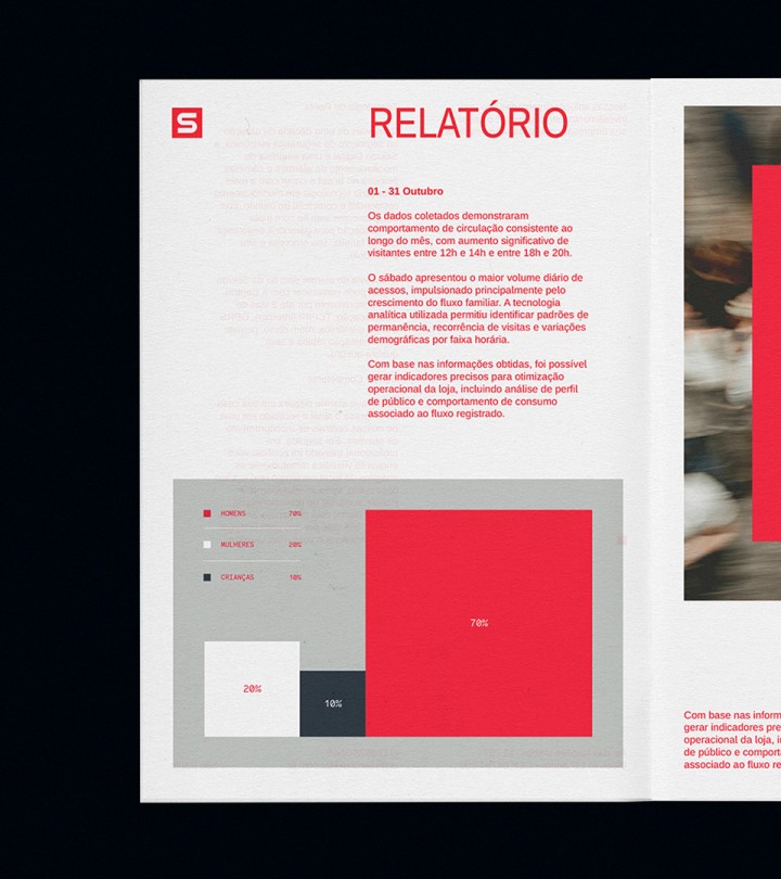
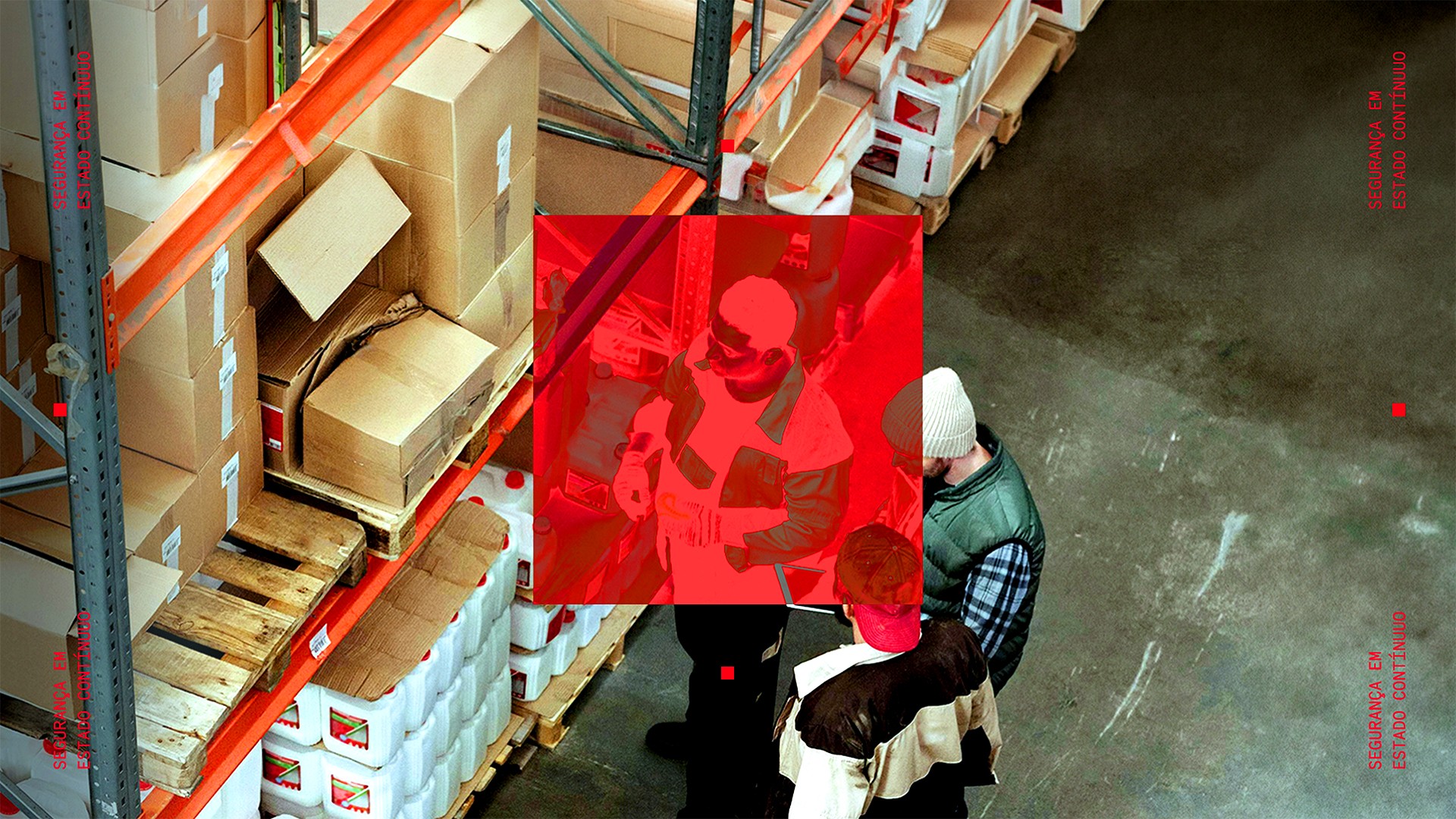
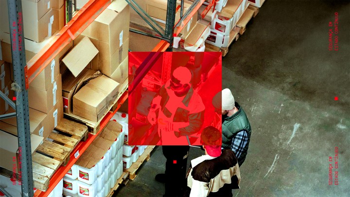
Keeping one of its most recognizable assets, the institutional red became more vibrant, heightening attention and alertness. From there, the same square that structures the logotype came to guide the entire visual system. It organizes layouts, highlights information, creates masks, and turns into data itself, graphically translating the analytical logic behind the operation, from institutional communications to dashboards.
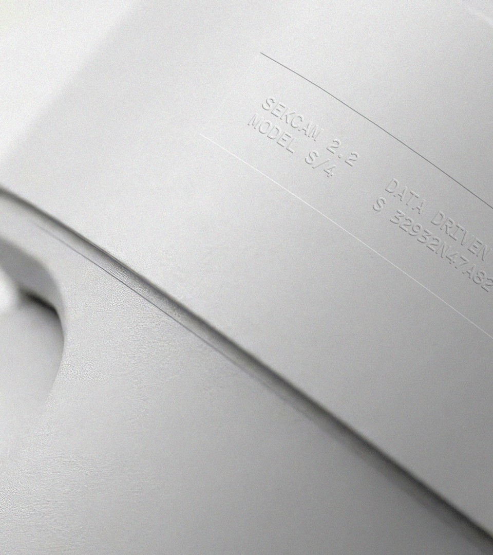
In photography, we set aside the sector's usual clichés. When portraying people, we explored framings that convey focus and analysis; for products, we prioritized detail and cleaner compositions.
The result is an identity that connects tradition and technology to precisely reflect where the company stands today: an operation that has moved beyond surveillance to establish itself as intelligence applied to security.